<!DOCTYPE html>
<head>
<title>chart.Js</title>
<link type="text/css" rel="stylesheet" href="{{
url_for('static', filename='style.css') }}"/>
</head>
<body>
<ul>
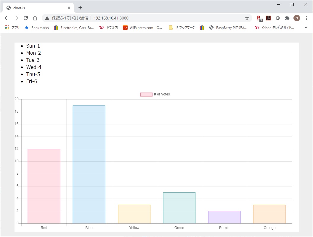
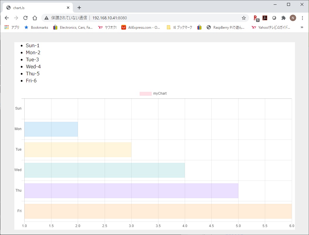
{% for no in range(valueIndex) %}
<li>{{ labelList[no] }}{{
valueList[no] }}</li>
{% endfor %}
</ul>
<script
src="https://cdnjs.cloudflare.com/ajax/libs/Chart.js/2.6.0/Chart.min.js"></script>
<canvas id="myChart" width="200"
height="100"></canvas>
<script>
// define the chart data
//
https://www.patricksoftwareblog.com/creating-charts-with-chart-js-in-a-flask-application/
var chartData = {
labels: [
{% for item in labelList %}
"{{item}}",
{% endfor %}],
datasets: [{
label: '{{ chartTitle }}',
data: [
{% for item in valueList %}
{{item}},
{% endfor %}],
backgroundColor: [
{% for item in backgroundColorList %}
"{{item}}",
{% endfor %}],
borderColor: [
{% for item in backgroundColorList %}
"{{item}}",
{% endfor %}],
borderWidth: 1
}]
}
var ctx =
document.getElementById('myChart').getContext('2d');
var myChart = new Chart(ctx, {
type: 'bar',
data: chartData,
options: {
scales: {
yAxes: [{
ticks: {
beginAtZero: true
}
}]
}
}
});
/*
var myChart = new Chart(ctx, {
type: 'bar',
data: {
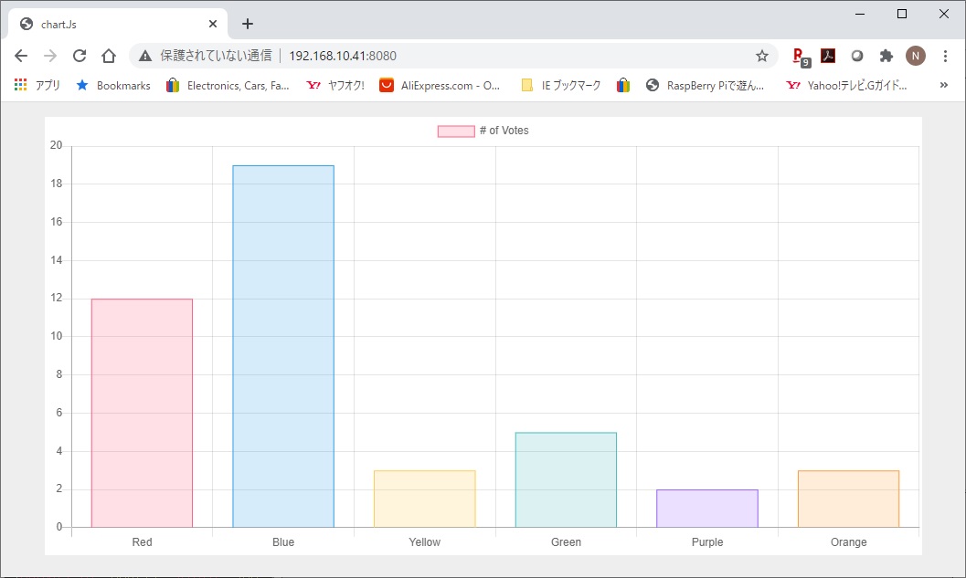
labels: ['Red',
'Blue', 'Yellow', 'Green', 'Purple', 'Orange'],
datasets: [{
label: '# of Votes',
data: [12, 19, 3, 5, 2, 3],
backgroundColor: [
'rgba(255, 99, 132, 0.2)',
'rgba(54, 162, 235, 0.2)',
'rgba(255, 206, 86, 0.2)',
'rgba(75, 192, 192, 0.2)',
'rgba(153, 102, 255, 0.2)',
'rgba(255, 159, 64, 0.2)'
],
borderColor: [
'rgba(255, 99, 132, 1)',
'rgba(54, 162, 235, 1)',
'rgba(255, 206, 86, 1)',
'rgba(75, 192, 192, 1)',
'rgba(153, 102, 255, 1)',
'rgba(255, 159, 64, 1)'
],
borderWidth: 1
}]
},
options: {
scales: {
yAxes: [{
ticks: {
beginAtZero: true
}
}]
}
}
});
*/
</script>
</body>
</html>
|